 Line
Mark variant 1
Low confidence comparison reconstruction.
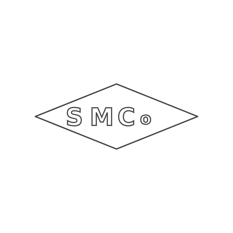
Source: a wide horizontal lozenge (diamond) punch holding sans-serif capitals S M C and then a small lowercase o (the 'Co' abbreviation), read left to right on one line, with a slightly wider gap after S. I checked the gaps between letters and between the letters and the border and found no stops or pellets. Drawing: a single-line lozenge with similar proportions, about 2.5: 1, holding outlined sans-serif S M C and a small o in the same order and the same horizontal position, with the same wider gap after S. The letters fill a similar share of the lozenge as in the source. All lines have the same weight, the background is plain white. Nothing has been added or dropped. Struck lozenge (horizontal diamond) punch containing bold sans-serif capitals S M C followed by a smaller raised lower-case o (abbreviation 'Co'). No stops visible between letters or between letters and the border. Revision 2: the stray dash fragments along the lozenge edges were rendering artefacts of the wobble displacement filter on the diagonal lines; the filter has been removed so each edge is one clean continuous single line of uniform weight. Letters, positions, font and border geometry are unchanged from round 1.