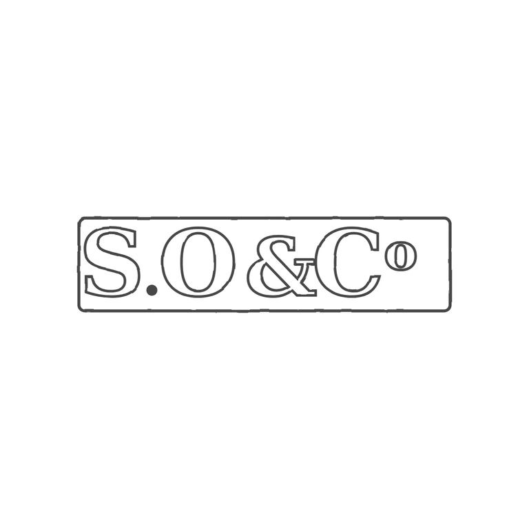
 Line
Mark variant 1
Low confidence comparison reconstruction.
Source: a single rectangular punch with slightly rounded corners holding bold serif capitals 'S.O&C' and a raised small 'o' after the C (the Co abbreviation, transcribed as 'o'). There is a solid stop at the baseline between S and O and no stop between O and &, or between & and C. Drawing: a rounded-rectangle single frame with outlined serif capitals S, a baseline solid stop, O, &, C, and a raised small o. These are in the same order, the same orientation and the same left-to-right reading direction. The glyph lists match. The letterforms are serif roman in both. The photographic texture is removed, the background is white, the stroke weight is uniform, and the mark is centred with a wide white margin. Minor: the drawing leaves a little more space between the raised o and the right edge of the frame than the source does, which is not enough to fail. Single rectangular punch with slightly rounded corners, raised bold serif capitals on a dark sunken ground, reading S. O & C o in one line. A solid stop sits at the baseline between S and O. The ampersand between O and C is heavily filled/worn into a compact blob. The final o is a small raised superior letter (C with superscript o).
