 Line
Mark variant 1
Low confidence comparison reconstruction.
Source-recorded mark text: Southington C. Co., quadruple plate
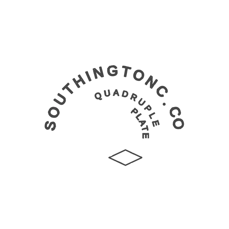
Source: unframed mark. SOUTHINGTON C.CO runs in a sans-serif arc over the top, from lower left up and down to the right, with a single solid stop between the two Cs. Inside it, QUADRUPLE curves down the right side, with PLATE set at an angle below it and a hollow horizontal lozenge underneath. The ©925-1000.com watermark belongs to the photo, not the mark. Drawing: the same arc, the same stop position, the same inner QUADRUPLE/PLATE layout and the same hollow lozenge. Lettering is sans-serif capitals throughout. No border was added, there is. Struck mark without a border. Sans-serif capitals SOUTHINGTON C.CO run clockwise on a large outer arc, from lower left over the top and down the right side, with a solid stop between C and CO. Inside, QUADRUPLE follows a smaller concentric arc from top centre down to the right. PLATE sits on a still smaller concentric arc below the end of QUADRUPLE, toward the C.CO side. A small outlined lozenge (diamond) sits at the bottom centre. Revision 2 changes: PLATE is now set on a curve following the inner arc, to the right under RUPLE, instead of flat and centred. All lettering now uses the same treatment. Font size and stroke width are matched so each glyph outline closes into a single solid-looking stroke instead of a hollow double line. The outer arc uses 76 px glyphs with a 7 px stroke; QUADRUPLE and PLATE use 46 px glyphs with a 5 px stroke, so they are lighter and thinner, matching the source's weight contrast. The whole mark has moved down about 103 px so it sits centred vertically (roughly y 358 to 905). Glyphs keep fill=none with a stroke, as the brief requires.