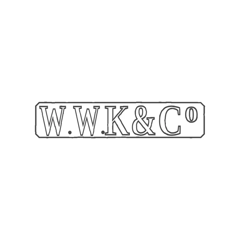
 Line
Mark variant 1
Low confidence comparison reconstruction.
Source: one horizontal rectangular punch with clipped (canted) corners, serif roman capitals reading W.W.K&Co, with small solid stops at the baseline after each W and a raised small o after C. Drawing: the same canted-corner rectangle in a single line, outlined serif capitals W.W.K&C with baseline stops in the same places and a raised small o, on a clean white background with the mark centred and plenty of margin. The drawn superscript o is a bit narrower and more oval than the rounder o in the source, but it is still clearly the same glyph. The source photo is small and the stops are faint, though they appear to be in the same gaps the drawing uses. Single elongated rectangular punch with canted corners containing bold roman capitals 'W.W.K&Co': two solid stops at the baseline after each W, an ampersand, and a raised lowercase 'o' after C, its top level with the capitals. Revision 2: the letters are now taller and bolder (font-size 225, stroke 7) so the capitals almost touch the top and bottom of the frame. They are also widened and spread out so the lettering runs from just inside the left end to just inside the right end, and the final 'o' sits close to the right end of the punch. The frame outline, stops and letter order are unchanged.