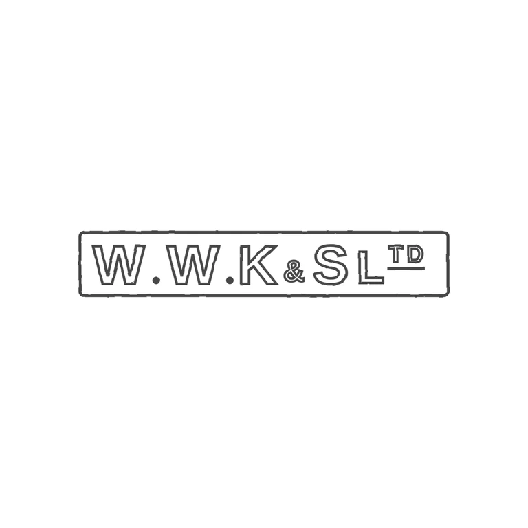
 Line
Mark variant 1
Low confidence comparison reconstruction.
Source: a single-line rectangular punch with slightly rounded corners holding outlined sans-serif capitals W.W.K&S LTD. There are solid stops between W and W and between W and K, and a small ampersand sits between K and S. The T and D after L are raised and underlined. There is no stop after K or S. The drawing reproduces the same rectangular frame, letters, two mid-low stops, small ampersand, and raised underlined TD in the same order and orientation. It uses uniform outline strokes on a white background, and the mark is centred with a wide margin. Long rectangular punch with slightly rounded corners holding bold sans-serif capitals 'W.W.K&S' and the abbreviation Ltd. There is a solid stop after each W, and a small ampersand sits low between K and S. The abbreviation is written as a large L followed by small raised T and D, which sit on a short horizontal underline bar. Revision 2: the L is now drawn almost at full cap height. T and D are drawn clearly smaller and raised to the top of the punch, and a single short bar is added under them. Everything else is unchanged from r1.