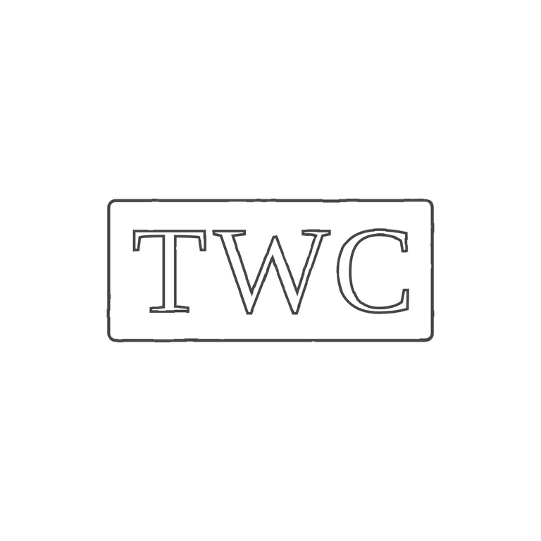
 Line
Mark variant 1
Low confidence comparison reconstruction.
Source: one rectangular punch with slightly rounded corners holding the serifed capitals T, W, C, upright and reading left to right. I checked the gaps between T and W, between W and C, and between the letters and the frame, and saw no stops or devices. Drawing: one rounded rectangle with serifed outline capitals T W C in the same order and orientation. Minor difference: in the source the letters are spread more evenly across the width of the punch, with wider gaps. The drawing groups them a little more tightly, but no glyph or frame is affected. Single struck oblong punch, roughly 2.3: 1, with a single raised outline (corners slightly softened). Three evenly spaced roman serif capitals T W C on one line, filling most of the punch height. No stops visible in the gaps between letters or between letters and border.