 Line
Mark variant 1
Low confidence comparison reconstruction.
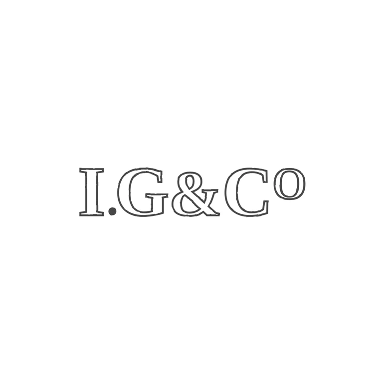
Source is a tight crop of a struck mark reading serif I, a solid stop at baseline, G, ampersand, C and a raised small o (C with superscript o); no punch outline is visible in the crop, so border: no. The first letter is read as a serif I (top and bottom serifs), though the worn strike makes the top serif look slightly broad. In the source the 'o' is a letter in the Co abbreviation, not a ring device, so it is recorded as the letter o. Drawing shows the same sequence I. G & C(raised o) in outlined roman serif letters, matching the source's roman serif style. It has no frame, a white background, consistent outline strokes, and is centred with a generous margin. Incuse-style struck mark without a visible punch border reading I.G&Co in bold roman serif capitals: I, solid stop, G, ampersand, C, and a raised lower-case o. Revision 2: the final o is now drawn larger (about 60% of cap height), in regular weight with slightly widened proportions so it reads as a round lower-case o rather than the digit 0, and lowered so its top sits roughly level with the top of the C. All other elements unchanged from the previous round.