 Line
Mark variant 1
Low confidence comparison reconstruction.
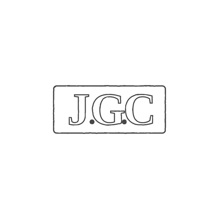
Source: a single rectangular punch with slightly rounded corners holding roman serif capitals J G C, with a solid stop at the baseline between J and G and another between G and C. Drawing: the same rectangular frame with slightly rounded corners, outlined roman serif J, G, C in the same order, and solid baseline stops in both gaps. Nothing has been added or dropped. The photographic texture is gone, the background is white, the line weight is uniform, and the mark is centred with a wide white margin. The drawn letters sit a little less tightly in the frame than in the source, which is within tolerance. Single struck rectangular punch with slightly rounded corners, wider than tall (about 2.4: 1). Bold serif capitals J G C read left to right, with a solid stop at the baseline between J and G and between G and C. The letters fill most of the punch height.