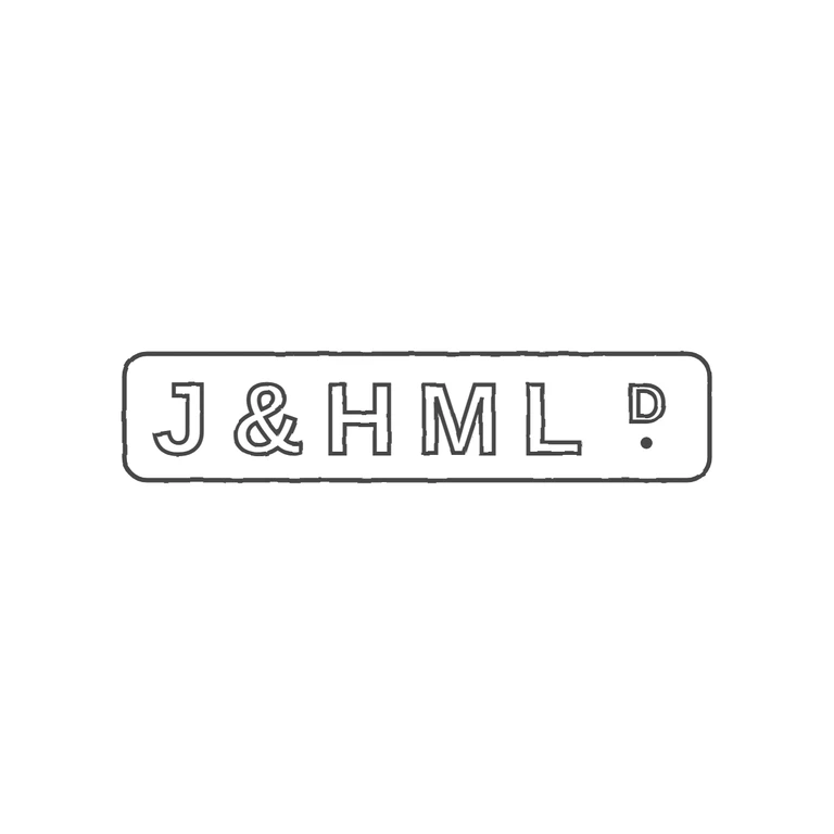
 Line
Mark variant 1
Low confidence comparison reconstruction.
The source is a single horizontal rounded-rectangle punch reading J & H M L, followed by a small raised D with a pellet beneath it (the 'Ltd' abbreviation). The letters are heavy block sans-serif capitals. The drawing has the same rounded-rectangle outline and the same sequence of block-sans outline capitals, with a raised small D and a solid pellet below it. It has no frames or content that aren't in the source, a clean white background, a consistent outline stroke, and the mark is centred with a wide margin. Minor note: the letters in the drawing are spaced a bit more openly than the tightly packed source, and the D sits slightly further from the L. This does not change the content or reading. Single elongated rounded-rectangle punch reading 'J&HMLD.' in bold sans-serif capitals: J, ampersand, H, M, L, then a small raised D with a solid stop beneath it at the right end of the punch. Revision 2: switched to Liberation Sans Bold so the J sits on the common baseline at the same height as H, M and L, clear of the frame; respaced the letters evenly across the full width of the frame (closing the J–& gap) so the raised D and its stop sit near the right end of the punch, as in the source.