 Line
Mark variant 1
Low confidence comparison reconstruction.
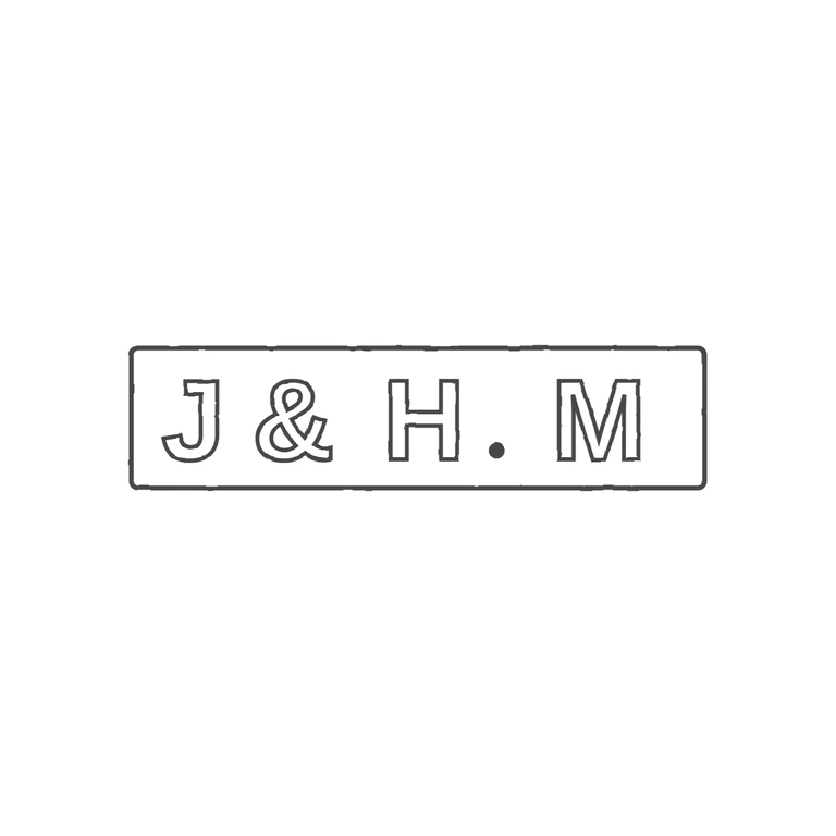
Source is a very small, tightly cropped photo of a horizontal rectangular punch reading J & H. M in bold upright capitals, with a solid stop at baseline between H and M and no stop between J, & and H. The crop runs right along the edges of the recessed rectangular field, so I read that edge as the punch outline. It is faint, so border: yes is a judgement from the field edges. The drawing shows the same sequence, J & H. M, in a rectangle with slightly rounded corners. It uses the same upright sans-serif capitals drawn as outlines, the stop sits at the baseline between H and M, and nothing has been added. The background is pure white, there is no photo texture, the line weight is consistent, and the mark is centred with a wide margin. The drawing spaces the letters a little more widely than the source, but this does not change the content or the order. Small low-resolution image of a single rectangular punch (about 4: 1 aspect) reading J&H.M in bold sans-serif capitals on one line, with a solid stop on the baseline between H and M. No stop between J and &, or between & and H. The punch outline shows as a faint rectangle with slightly rounded corners; it is drawn as a single line.