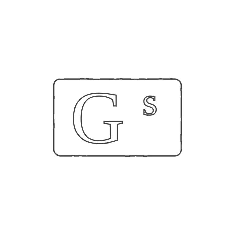
 Line
Mark variant 1
Low confidence comparison reconstruction.
Source: a rectangular punch with slightly rounded corners and a single outline. Inside is a large roman serif capital G, with a small lowercase roman s raised to the upper right like a superscript. I saw no stops or devices in any gap. Drawing: the same rounded rectangular frame drawn as one line, a serif roman G with a spurred crossbar and a raised small s at the upper right, in the same order and orientation. All lines are drawn in the same thin dark grey, the background is plain white and the mark sits in the centre with a wide margin. Small difference: in the drawing the G is a little smaller compared with the frame and the gap between G and s is a bit wider than in the source. This does not change any glyph or the layout. Struck mark in a horizontal rectangular punch with slightly rounded corners. A large serif capital G occupies the left two-thirds; a small lower-case serif s is raised to the upper right, its top level with the top of the G. No stops or devices are visible in the gaps.