 Line
Mark variant 1
Low confidence comparison reconstruction.
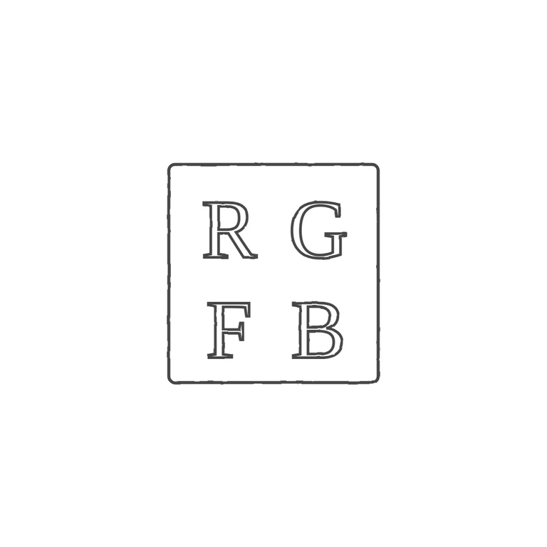
Source: a square punch with slightly rounded corners holding four roman serif capitals in a 2x2 grid, R G on top and F B below. I checked the gaps between the letters and between the letters and the frame and found no stops or devices. Drawing: a single-line square frame with slightly rounded corners and the same four upright roman serif capitals in the same 2x2 layout, R G over F B, drawn as consistent outlined strokes. The background is plain white, there is. The glyph lists match and every rubric item is true. Roughly square struck punch with a plain rectangular outline and slightly softened corners, holding four serif capitals in two rows: R G above, F B below. The letters are moderately heavy roman capitals that sit fairly evenly in the four quadrants.