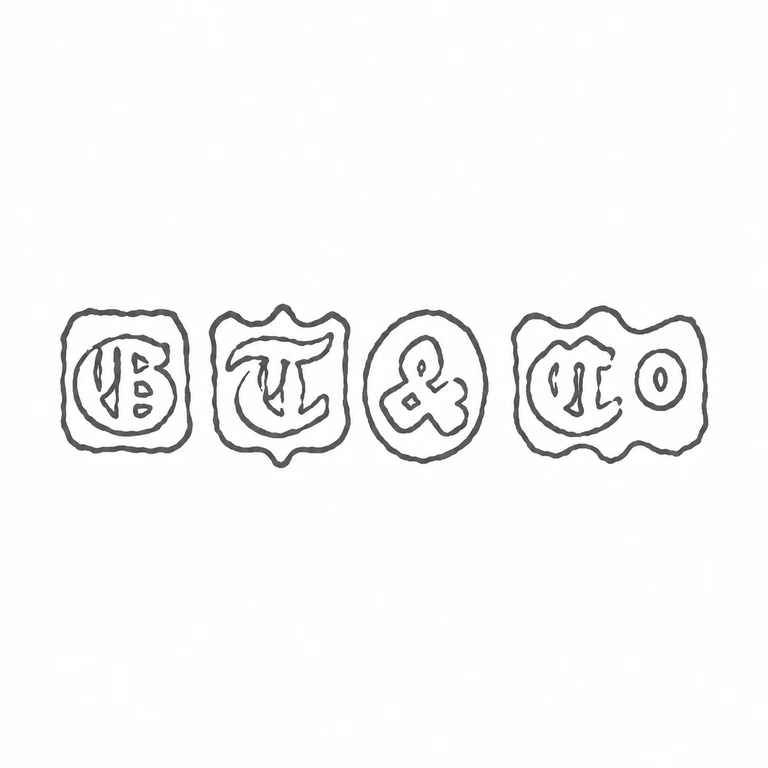
Four left-to-right punches are retained: GB in a rounded rectangular punch with an inner oval field, TC in a scalloped rectangular punch, an ampersand in a round punch, and Co in a scalloped rectangular punch. The reading direction, the visible glyph count and order, the small enclosed counters, the four source-supported punch outlines, and the source's irregular contour character.
Other recorded variants
1 variant
Line
Mark variant 2
Low confidence comparison reconstruction.
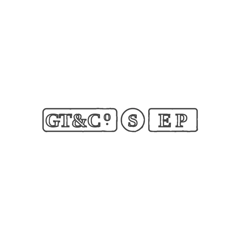
Source-recorded mark text: GT&Co, S, EP
Source (very low resolution) shows three punches in a row: a rounded rectangle with serif 'GT&C' followed by a raised small 'o' with a mark beneath it (read as a stop), a circular punch with 'S', and a rounded rectangle with 'EP'. The drawing reproduces the same three punch shapes in the same order and sizes relative to each other, with serif shadowed lettering GT&C, raised o with a dot beneath, circled S, and E P. Line weight is uniform, background is pure white, no photo texture or watermark is carried over, and the strip is centred with a wide white margin. The 'o' token here means the small superscript letter o in 'Co', not a ring device; the stop under it is hard to make out at the source's resolution but matches what the drawing shows. The 'border: yes' token covers the punch outlines of all three cartouches. Three punches in a row. Left: rounded rectangle with bold serif capitals G T & C followed by a raised lowercase o, about half the cap height, sitting in the upper half after the C, with a small stop beneath it (reads like 'C9' in the photo). Middle: circular punch with a bold serif S. Right: rounded rectangle with bold serif E P, widely spaced. Revision 2: the o is redrawn larger as a clean single-outline lowercase o in the upper half after the C, and a small solid stop is added directly beneath it.
Source record
Source dates
1864-1908, succeeded by Travis, Wilson & Company Ltd.
 Line