 Line
Mark variant 1
Low confidence comparison reconstruction.
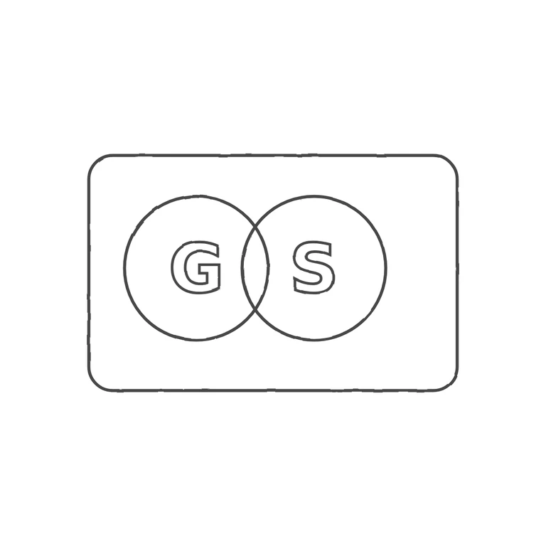
Source: a rounded-corner rectangular punch, wider than tall, holding two overlapping (interlaced) rings side by side. A sans-serif capital G (with a crossbar) sits in the left ring and a capital S in the right. There are no stops, pellets or other devices in the gaps between the letters, rings and border. Drawing: the same rounded rectangle, the same two overlapping rings with G left and S right, upright elements. White background, uniform grey line weight, mark centred with a wide margin. Minor differences that do not fail anything: in the source the rings fill more of the punch height and are struck as thicker bands, and the letters are a little larger relative to the rings. Struck mark in a landscape rounded-rectangle punch. Inside are two overlapping plain rings of equal size, set side by side. Each holds one bold sans-serif capital: G in the left ring and S in the right ring. The ring pair sits slightly left of centre in the punch, leaving more space on the right. I saw no stops in the gaps between the letters, rings and border.