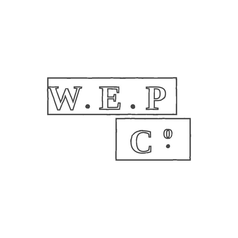
 Line
Mark variant 1
Low confidence comparison reconstruction.
Source: a rectangular punch with bold serif roman 'W.E.P' and solid stops at the baseline between the letters. Below it and offset to the right is a second punch with 'C' and a raised small 'o' with a solid stop under it. The second punch's left edge shows as a dark vertical edge left of the C, and its bottom is cut off by the photo. Drawing: the same two rectangular frames, the same serif capitals, baseline stops between W/E and E/P, and C with a superscript o over a stop. The order and offset layout match. Minor points, none of which fail the check: the W's left serif almost touches the frame, as it does in the source; the lower punch sits slightly further right relative to the upper one than in the source; and the outlined superscript o is narrow enough to look a bit like a zero. The background is clean white, every glyph is drawn as a double outline with solid stops, and the mark is centred with a generous margin. Two struck punches read as one mark. Upper: bold serif capitals W. P with solid stops between them, inside a wide rectangular punch. Lower: a smaller punch set below and right of centre, with bold serif capital C and a raised lower-case o with a small stop beneath it (C°.). Each punch is drawn as a single rectangular outline. The 'o' token here is the raised letter o of 'Co', not a ring device.