 Line
Mark variant 1
Low confidence comparison reconstruction.
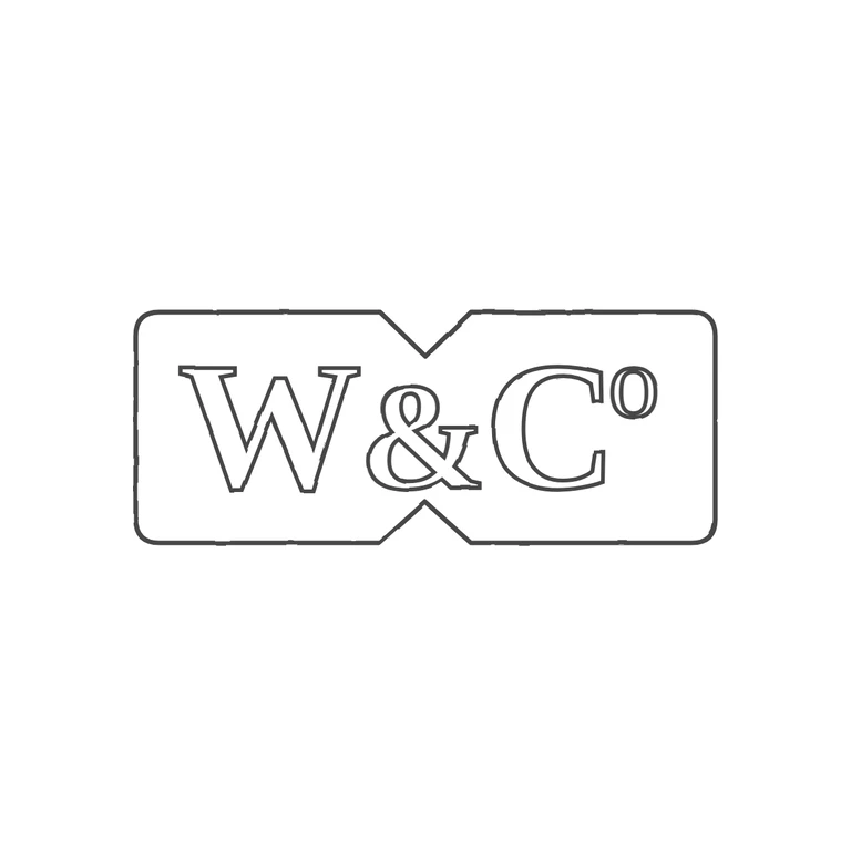
Source: a single rectangular punch with rounded ends and a V-shaped notch cut into the middle of both the top and bottom edges (bow-tie/X profile), containing the bold serif capitals 'W&C' and a raised small letter O (abbreviation 'Co'). No separate stops were visible in the gaps between letters or between the letters and the border. Drawing: the same notched rectangular outline, with the notches lined up at top and bottom centre, and outlined serif 'W & C' plus a superscript O in the same order and orientation. Clean white background, consistent outline stroke, and the mark is centred with a generous margin. The source photo is low-resolution, so I could not rule out a faint mark under the superscript O, but no clear stop is visible there. Struck rectangular cartouche with rounded ends and a V-shaped notch at the centre of the top and bottom edges. It reads 'W&Co' in bold roman serif capitals, with a small raised lowercase o next to the upper right of the C. Revision 2: the lettering is scaled up (W and C at 270, & at 225) and centred in the punch, leaving only small side margins, with the & placed between the two notches. The superscript o is now a regular-weight round lowercase o about as wide as it is tall. Its top is level with the cap height and it sits just clear of the C's upper right terminal. The single punch outline is unchanged.