 Line
Mark variant 1
Low confidence comparison reconstruction.
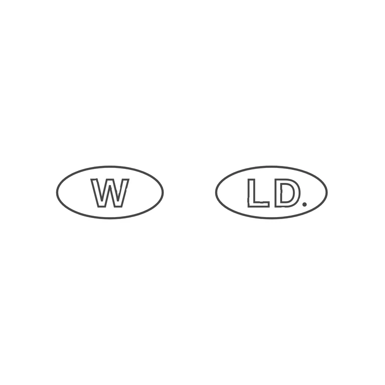
Source: two separate oval punches side by side, the left holding a single sans-serif W and the right holding sans-serif L D followed by a small stop at the baseline after the D. Both ovals are about the same size and the letters are raised and solid. Drawing: the same two ovals in the same order, with a W in the left one and L, D and a solid baseline stop in the right one. The letters are drawn as outlines with uniform-weight lines, which is acceptable as a line trace. Letterforms, oval shapes, orientation and order all match. The background is clean white and the pair is centred with wide margins. The glyph lists match. The one fault is the linework: the L contour, and to a lesser degree the D and W contours, have visible breaks and dashed segments where the outline should be continuous. Two separate oval punches side by side. Left oval: a single bold sans-serif capital W. Right oval: bold sans-serif capitals L D with a small solid stop at the lower right of the D. Revision 3: the stop now sits at the baseline just right of the D's foot, inside the oval and clear of the border; the wobble filter no longer applies to the ovals, so both are single smooth continuous outlines with no dash fragments or offset segments. Letters, spacing and proportions are unchanged from the previous round.