 Line
Mark variant 1
Low confidence comparison reconstruction.
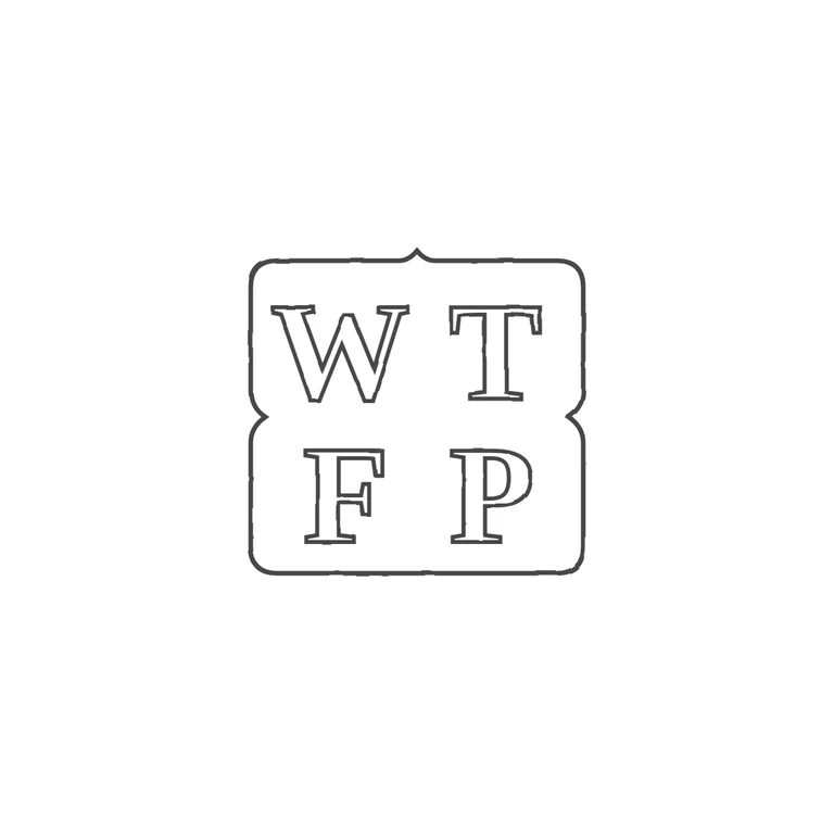
Source: a single punch shaped like a rounded square, with a small point at top centre and inward notches on both sides at mid-height. It holds serif roman capitals W T over F P, and I saw no stops or devices in any gap. Drawing: the same punch shape (top-centre point, side notches at mid-height, rounded corners) and the same outlined serif roman capitals in a 2x2 layout, W T over F P. Nothing has been added or left out. Thin dark-grey lines throughout, a clean white background. Struck maker's mark: bold roman serif capitals W T over F P, in two rows of two, within one shaped punch outline. Revision 2: the outline is now a single shaped line with rounded corners, an inward pinch (cusp) at mid-height on the left and right sides between the W/T row and the F/P row, and a slight raised point at the top centre, as the source shows. The letters, their positions and the font are unchanged from round 1. No stops or devices are visible.