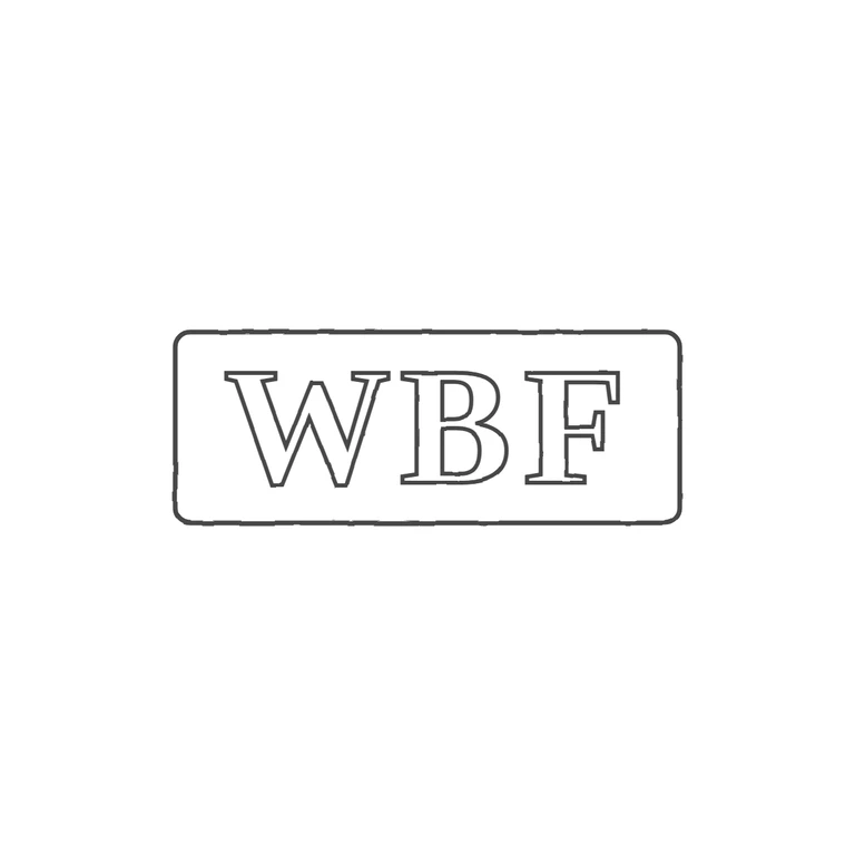
 Line
Mark variant 1
Low confidence comparison reconstruction.
Source: a single rectangular punch with slightly rounded corners holding three upright serif (roman) capitals, which read W B F. The middle letter has a closed upper and lower bowl, so it reads as B. No stops or devices are visible between the letters or between the letters and the frame. Drawing: an outlined rounded rectangle with the outlined serif capitals W B F, in the same order and orientation. The line weight is consistent, the background is plain white with no photo texture, and the mark sits centred with a wide margin. The glyph lists match and every rubric item holds. Single rectangular punch with slightly rounded corners containing three bold serif roman capitals W B F, evenly spaced and nearly filling the punch. Revision 2: on re-examining the source, the middle letter has a straight left stem and a rounded right side with closed upper and lower bowls, so it reads B, not H as previously drawn; it is now drawn as a bold serif B matching W and F. The extra gap before F was removed. The letters were enlarged slightly and spaced evenly across the punch. There are no stops in any gap. The maker label 'W H F' does not match the struck letters; the photograph.