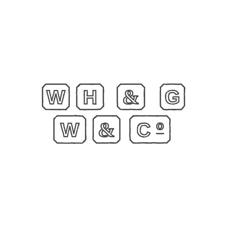
 Line
Mark variant 1
Low confidence comparison reconstruction.
Source shows seven separate cut-corner rectangular punches in two rows: top W, H, &, G; bottom W, &, and a wider punch holding C with a raised underlined o (Co abbreviation). No stops visible in the gaps. The drawing reproduces the same seven cut-corner punches in the same two-row layout and order, with the same bold sans-serif capitals, outlined ampersands and the raised underlined o after C. Uniform dark-grey outline treatment on white, mark centred with a wide margin. Seven separate struck punches in two rows, each an outlined rectangle with clipped corners: top row W | H | & | G, bottom row W | & | Co (the Co punch is wider). Letters are heavy plain sans-serif block capitals, so revision 2 redraws W, H, G, W and C in Liberation Sans bold without serifs. In the Co punch the small o sits high beside the C, superscript-style, with a short horizontal bar beneath it; it is now raised toward the top of the punch and the bar is drawn under it. The ampersands keep their earlier serif-style form, since the check did not flag them. Punch outlines, layout and spacing are unchanged from r1.