 Line
Mark variant 1
Low confidence comparison reconstruction.
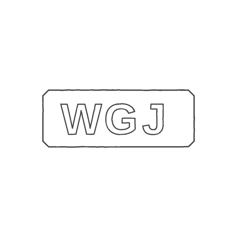
Source: one horizontal rectangular punch with clipped (chamfered) corners containing bold sans-serif capitals W G J, upright and left to right. No stops, pellets or devices in the gaps between letters or between the letters and the frame. Drawing: one chamfered-corner rectangle outline with outlined bold sans-serif W G J in the same order and orientation, single consistent stroke weight, pure white background, no texture, mark centred with a generous margin. Glyph lists match. Minor non-blocking difference: in the source the letters nearly fill the frame height and are roughly centred, but in the drawing they are slightly smaller and sit left of centre (more space after J than before W). Optional refinement: enlarge the letters slightly and centre them horizontally in the frame. Single struck mark: a horizontal rectangular punch with small chamfered (canted) corners enclosing three bold sans-serif capitals W G J in one line, evenly spaced, filling most of the cartouche height. No stops are visible between letters or between letters and the border.