 Line
Mark variant 1
Low confidence comparison reconstruction.
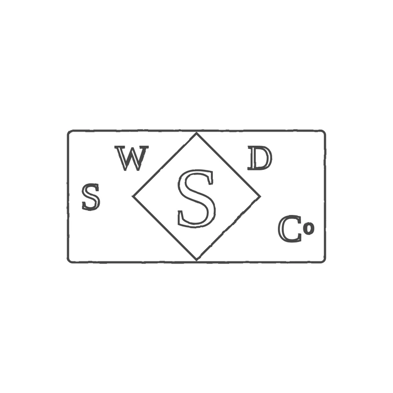
Source-recorded mark text: WD S S Co
Source is a very small, low-resolution photo of a horizontal rectangular punch (slightly rounded corners) with a diamond running from the top edge to the bottom edge. A large S sits inside the diamond. Outside it are S at the left middle, W at the upper left, D at the upper right, and C with a small raised o at the lower right. All letters are serif capitals. The drawing has the same layout: a rounded rectangle, a diamond touching both long edges, a large central S, and S, W, D and Co in the same corner positions with serif letterforms. I found no stops or pellets in the source gaps, and the drawing adds none. The source's '1825-1000.com' watermark is not part of the mark and was correctly left out. The drawing uses a consistent grey outline on pure white, centred with a generous margin. Because the source is so small, the exact positions of the corner letters are only approximately verifiable; nothing suggests a discrepancy. Hollow letter outlines vs. solid struck letters is a treatment choice, applied consistently. Small horizontal rectangular punch with one outline. A diamond (lozenge) outline sits in the centre, touching the top and bottom edges, and holds a large serif capital S. Small serif capitals sit in the spaces outside the diamond: an S at the far left at mid-height, a W at upper left beside the diamond, a D at upper right, and a C with a small raised o at lower right. Read in source order, the letters give the sequence S W [S in diamond] D Co.