 Line
Mark variant 1
Low confidence comparison reconstruction.
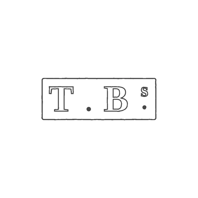
Source: a rectangular punch with a single border containing serif roman capitals T and B. There is a solid baseline stop between them, and after B a small raised 's' with a solid stop beneath it. Drawing: the same rectangular frame, outlined serif T, a baseline stop, outlined serif B, a raised small 's' and a stop below it at the baseline. The glyph lists match and the letterforms are comparable serif roman. The line weight is uniform, the background is white. Rectangular punch with slightly rounded corners holding bold roman serif capitals 'T. B' followed by a raised small lower-case 's' with a solid stop beneath it (reading as T.Bs with a colon-like s/stop group). Revision 2: the rectangle is a little narrower (720 px instead of 760 px), and the lettering is enlarged slightly and spread out. The T's left serif now has a clear gap from the left border, and the superscript s with its stop sits just inside the right edge, so the lettering spans the whole punch as in the source. Everything else is unchanged: one single border line, solid stops, outlined bold serif glyphs.