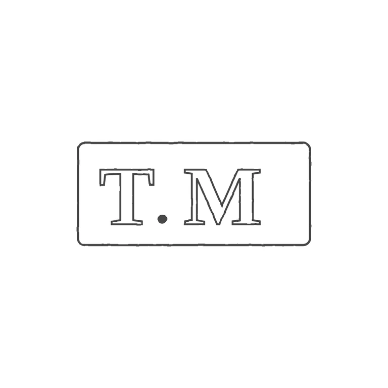
 Line
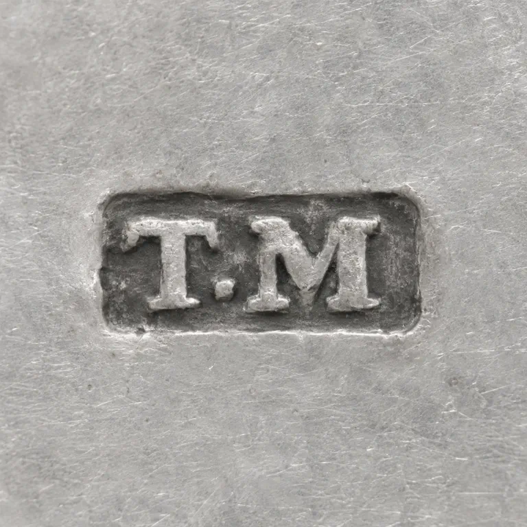 AI oxidized
Drag to compare L lineO oxidized
Mark variant 1
Low confidence comparison reconstruction.
Source (small, low-resolution photo) shows a single rectangular punch with slightly rounded corners holding serif roman capitals T and M, separated by a solid stop sitting low, near the baseline. Drawing shows the same rounded rectangle, outlined serif roman T, a solid low stop, and an outlined serif M, all upright and reading left to right. The glyph lists match. Minor note, not a failure: in the source the letters fill the punch closely, with M close to the right edge. In the drawing there is noticeably more empty space to the right of M than to the left of T, so the group sits slightly left of centre inside the frame. Background is pure white, the line weight is even, and the mark is centred with a generous margin. Small struck punch in a rectangular cartouche with slightly softened corners. It holds bold serif capitals T and M, with a small solid stop between them sitting low near the baseline. The M is wider than the T and fills the right half of the punch. The letters sit close to the border.


