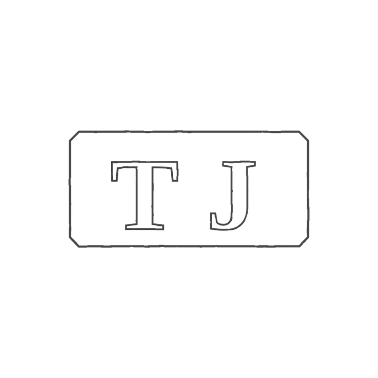
 Line
Mark variant 1
Low confidence comparison reconstruction.
Source (small, low-resolution photo) shows serif roman capitals T and J upright, side by side in a horizontal rectangular punch with cut/softened corners; I looked at the gap between T and J and at the gaps to the frame and saw no distinct stop or device, only punch texture. The drawing shows the same upright serif roman T and J in a horizontal rectangle with clipped corners, drawn in a consistent outline stroke on a clean white background, compact and centred with a generous margin. Minor difference that does not fail any rubric item: the source letters sit closer together and fill more of the punch height than in the drawing. Small struck mark: two bold serif capitals T and J inside a single horizontal rectangular punch with slightly clipped corners. Letters fill most of the punch height and are set close together. Drawn as outlined bold serif glyphs inside one octagonal-cornered rectangle outline.