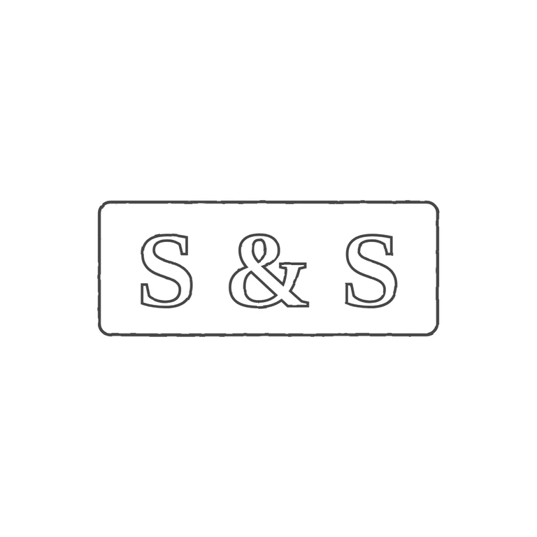
 Line
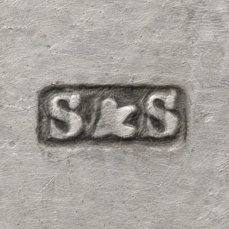 AI oxidized
Drag to compare L lineO oxidized
Mark variant 1
Low confidence comparison reconstruction.
Source: a small, worn rectangular punch with slightly rounded corners holding the serif capitals S & S in one line, upright and reading left to right. I found no stops in the gaps between the letters or between the letters and the frame. Drawing: the same rounded rectangle and serif S & S in a consistent dark outline on white, centred with a wide margin, and nothing added. One small difference: in the source the letters are packed tightly and almost fill the punch from top to bottom. The drawing spaces them more widely and leaves more room inside the frame, and its frame is slightly less elongated (about 2.5: 1 against about 3: 1). This is within tolerance and does not change any glyph, letterform style or the punch shape. A single horizontal rectangular punch with slightly rounded corners holds three bold serif-style characters in one line: S, an ampersand, then S. The two S letters are about the same size and sit close to the top and bottom edges of the punch. The ampersand is about as tall as the S letters. No stops are visible in the gaps. The drawing uses one rounded-rectangle outline and outlined bold serif glyphs.