 Line
Mark variant 1
Low confidence comparison reconstruction.
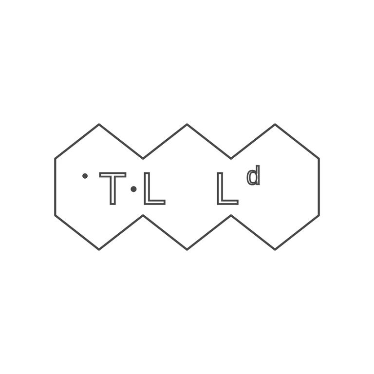
Source: a single punch outline made of three joined pointed hexagons (pointed top and bottom), reading 'T·L L' with a small raised 'd' after the second L (Ltd). There is a small pellet high up at the left before the T, and a stop at mid-height between T and the first L. No other stops are visible between the letters or between the letters and the frame. Drawing: the same three-hexagon outline in roughly the same proportions (about 0.7 width to height per cell). It has the upper-left pellet, T, a mid-height stop, L, L and a superscript d, all upright, sans-serif and in outline. Scaled to the source, the letter positions match closely: T sits right of the first cell's centre, the first L left of the middle cell's centre, and Ld in the third cell. The background is plain white with no photo texture, the lines are a uniform dark grey and the margin is generous and centred. Struck punch shaped as three conjoined hexagons in a row (single continuous outline). Inside: a stop before T, sans-serif capital T, a mid-height stop, capital L, a wider gap, capital L followed by a small raised lowercase 'd' (the 'Ld' abbreviation). Revision 2: the raised letter is redrawn as a superscript lowercase d with an ascender; the wobble displacement filter that produced stray dash fragments along the hexagon edges was removed so the border is one clean continuous line. Everything else unchanged.