 Line
Mark variant 1
Low confidence comparison reconstruction.
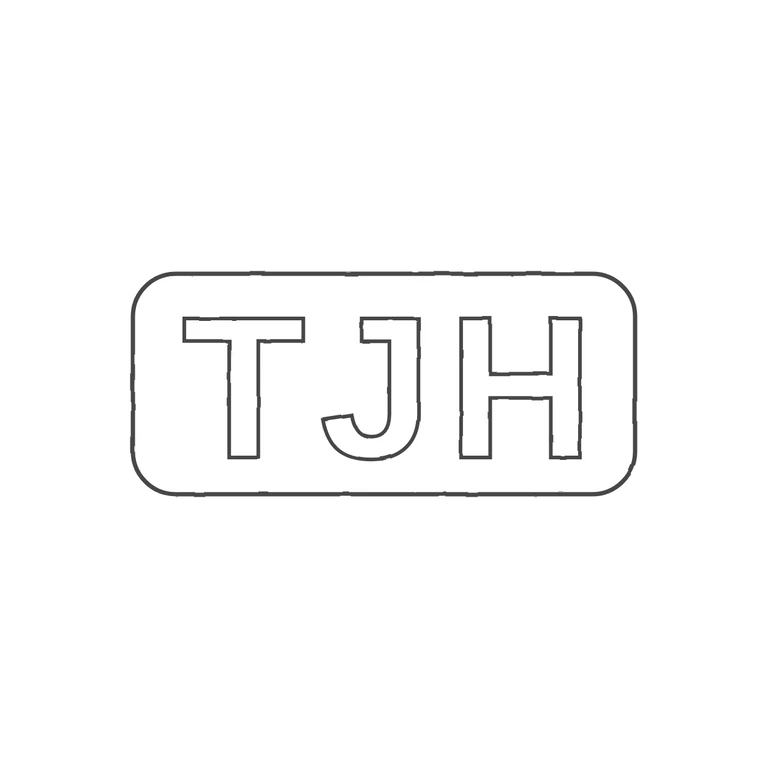
Source shows bold sans-serif capitals T J H, upright and left to right, in a single rounded-rectangle punch. I saw no stops or devices in the gaps between the letters or between the letters and the border. The drawing has the same three sans-serif capitals in the same order inside a single rounded-rectangle outline. It uses a uniform dark outline on a white background. The mark is centred with a wide white margin. The letters sit a little more loosely inside the frame than in the source, but the glyphs, order, letter style and punch shape all match. Single struck punch: a horizontal rounded-rectangle cartouche, about 2.3: 1, with three bold sans-serif capitals T J H set close together and filling most of the field. The letters are evenly spaced and there are no visible stops or devices between the letters or between the letters and the border.