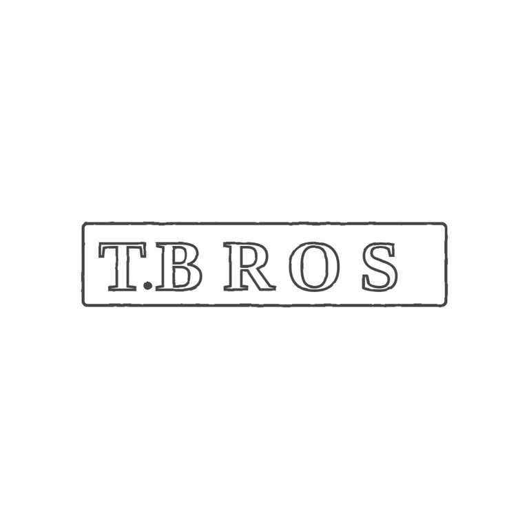
 Line
Mark variant 1
Low confidence comparison reconstruction.
Source is a small, low-resolution photo of a single rectangular punch with incuse serif capitals reading T.BROS on one line, with a solid stop at the baseline between T and B. The drawing reproduces the same rectangular frame and the same serif roman capitals T. B R O S in outline, with the stop in the same place, upright, on a clean white background with a uniform grey stroke, centred with a wide margin. One small difference: in the source, R O S sit closer together and run nearly to the right edge of the frame. The drawing spaces them more widely and leaves extra empty space at the right inside the frame. This is spacing only, not a change of glyph or letterform, so it does not fail any rubric item. Single horizontal rectangular cartouche with slightly rounded corners enclosing bold serif capitals reading T.BROS: a T, a solid stop at baseline, then B R O S. The letters fill most of the punch height and run nearly edge to edge. The T and B are the clearest; R, O and S are softer but their shapes can still be made out.