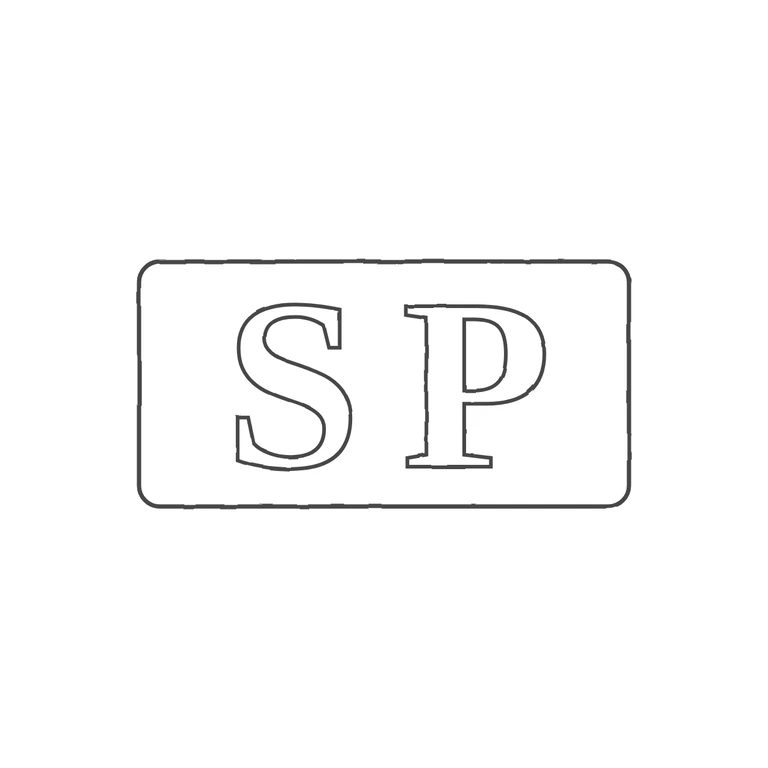
 Line
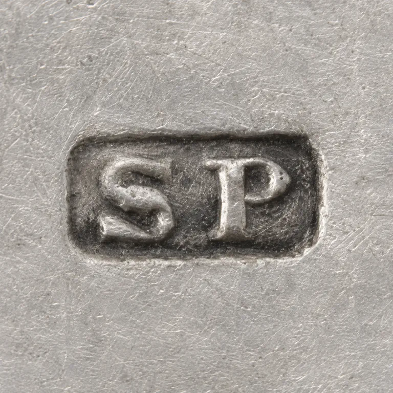 AI oxidized
Drag to compare L lineO oxidized
Mark variant 1
Low confidence comparison reconstruction.
Source: a small, low-resolution photo of a single horizontal rectangular punch with softened corners, holding roman serif capitals S and P upright, reading left to right. I could not make out a stop between S and P or between the letters and the border, but at this resolution a faint pellet can't be ruled out completely. Drawing: a rounded-rectangle outline with outlined roman serif S and P in the same order and orientation, an even line weight, a white background. The glyph lists match and the punch shape is the same. Struck incuse-style punch: two heavy roman serif capitals 'S P' side by side in a single rectangular punch outline with slightly rounded corners, about twice as wide as high. Letters fill roughly two thirds of the punch height; S sits left of centre, P right of centre with a modest gap between them. Drawn as one outlined border and two outlined bold serif glyphs.
