 Line
Mark variant 1
Low confidence comparison reconstruction.
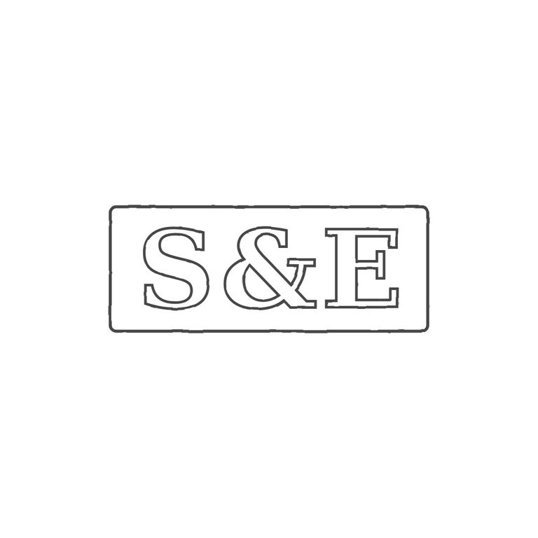
Source is a very small, tightly cropped photo of an incuse rectangular punch reading S & E in serif roman capitals. The shaded rim along the top, left and bottom edges is read as the rectangular punch outline. No stops, pellets or devices are visible in the gaps between the letters or between the letters and the edge. The drawing shows the same three characters in the same order: serif roman S, ampersand, E, each drawn as an outline, inside a single rounded rectangle. It is upright, centred with a generous white margin on a white background, has a uniform stroke. Caveat: the source resolution is low. The frame is inferred from the edge shading, and the exact ampersand letterform cannot be compared in detail, but nothing clearly differs. Small, low-resolution photograph of one struck punch mark. It shows three heavy serif characters in a single horizontal line: capital S, an ampersand and capital E. They sit inside a wide rectangular punch outline with slightly rounded corners, about 2.6: 1 in proportion. No stops are visible between the characters or between the characters and the border. Drawn as one rectangle with bold serif outlined glyphs.