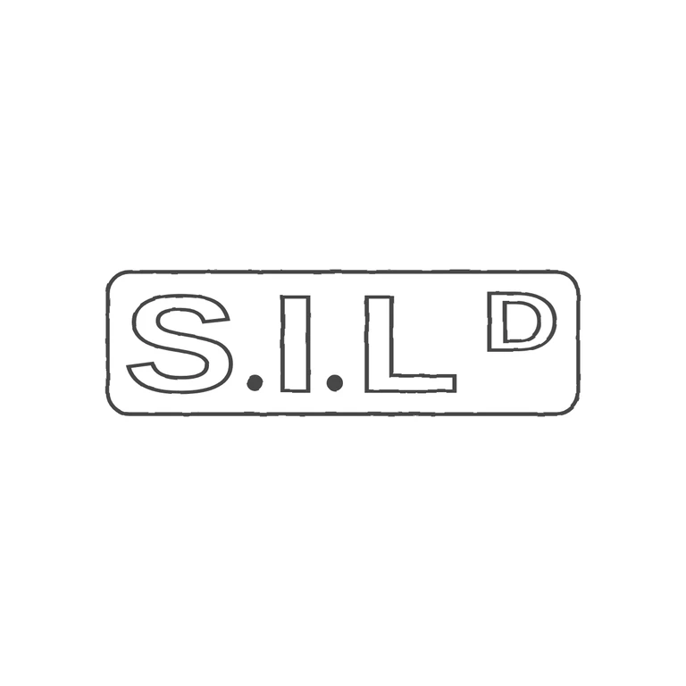
 Line
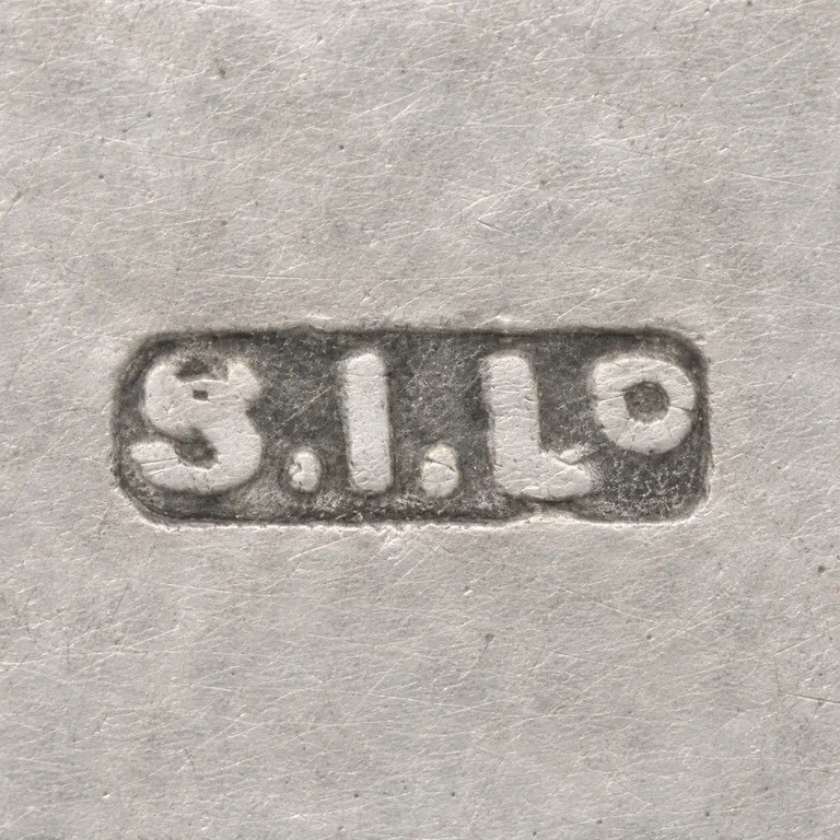 AI oxidized
Drag to compare L lineO oxidized
Mark variant 1
Low confidence comparison reconstruction.
Source is a small, low-resolution photo of a single horizontal rectangular punch with softened corners, containing bold sans-serif capitals 'S. L' and a smaller raised 'D' (the Ltd abbreviation) after the L. Solid stops sit on the baseline between S/I and I/L; no stop is visible after the L or the D. The drawing matches: one rounded-rectangle border, the outlined sans-serif S, I and L, two solid baseline stops, and a smaller raised D at the top right. The background is white, there is. Because the source is so small, the exact height and position of the raised D can only be judged roughly, but it is consistent with the drawing. Revision round 2: a single rounded-rectangle punch with bold, broad sans-serif capitals S. L and a raised small D (abbreviation for Ltd) at the upper right. As the checker asked, the lettering is now wider and heavier: the glyphs are stretched horizontally (x1.25 to x1.3) at a larger size, the stroke weight is 7, and the gaps to the border are tighter. The letters are spread across the frame so the raised D sits close to the right border. The border, letter order, the two solid stops on the baseline and the raised D are kept from r1.


