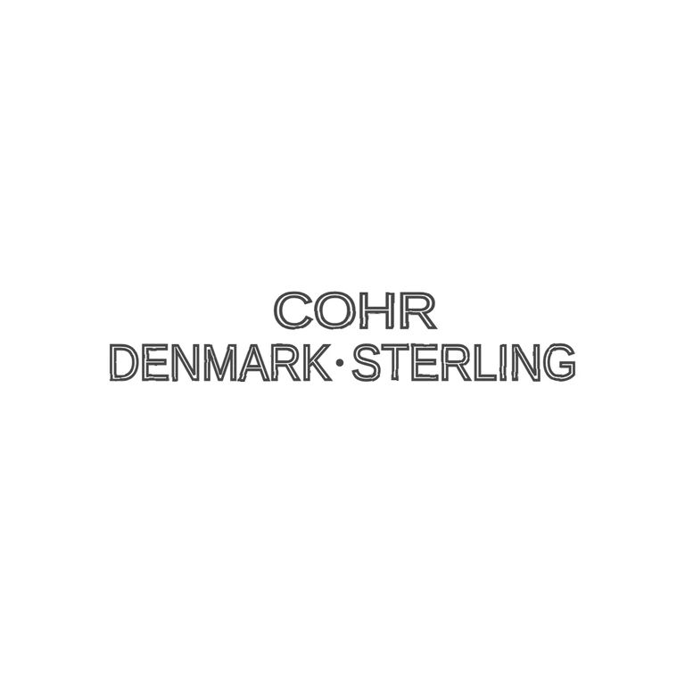
 Line
Mark variant 1
Low confidence comparison reconstruction.
Source: the clear inset at top left shows a two-line stamp in plain sans-serif capitals, 'COHR' centred above 'DENMARK·STERLING', with a solid mid-height stop between K and S. The rectangle around the inset is a presentation box added to the photo, not a punch outline, so the mark has no border (the same text struck on the rings also has no frame). Drawing: the same two lines in sans-serif capitals, drawn as consistent double-line outlines, with the mid-height stop between K and S. There is no frame. The mark sits roughly centred on white with generous margins. 'COHR' sits a little right of centre over the lower line, about the same as in the source. The glyph lists match exactly. The photograph shows two napkin rings plus a clean inset reproduction of the mark (top left), and the drawing follows that inset. Two lines of thin sans-serif capitals: 'COHR' on top, roughly centred over the second line (slightly right of centre), and 'DENMARK·STERLING' below, with a small raised solid dot between the two words. The stamped mark on the rings shows the same lettering with no cartouche, so the rectangular frame round the inset is taken as the photographer's frame, not a punch border.