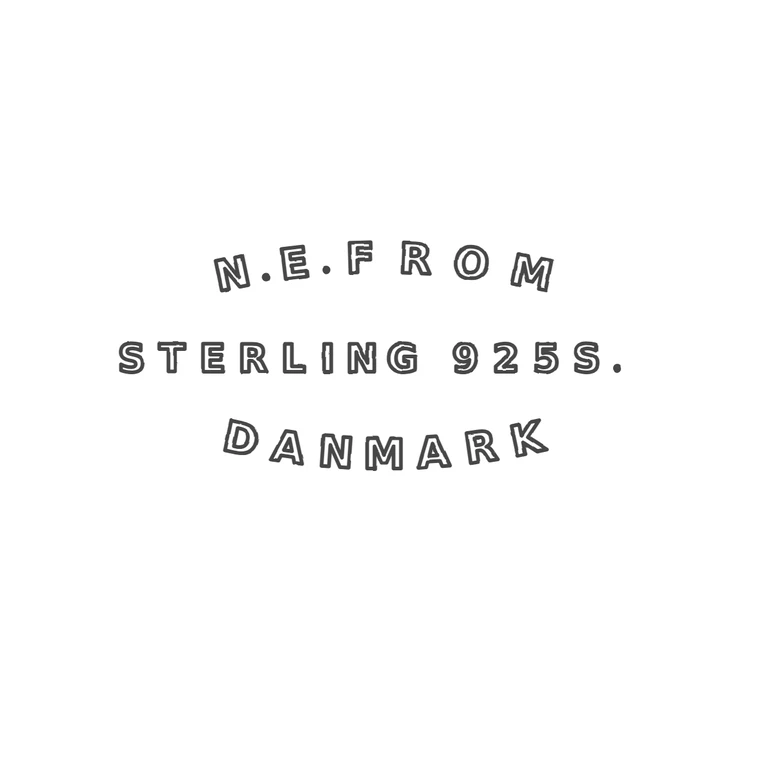
 Line
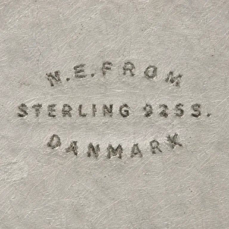 AI oxidized
Drag to compare L lineO oxidized
Mark variant 1
Low confidence comparison reconstruction.
Source inset (the black rectangle is the photo's inset frame, not a punch outline) shows three lines of small widely spaced sans-serif capitals with no punch border: 'N.E.FROM' arched convex-up, 'STERLING 925S.' straight with a trailing stop, 'DANMARK' arched concave-up. Stops sit between N and E and between E and F; I could not resolve a stop after M at this resolution. The drawing reproduces the same three lines, the same arcs, the same stops and the same spaced sans-serif capitals. It uses one consistent outlined-stroke treatment on a plain white background content, and the mark is centred with generous margins. Caveat: the source is low resolution, so the glyph-level reading, especially the stops, is a best reading. Three-line stamped sans-serif capital mark with no border, shown in the photo's inset. Line 1, 'N.E.FROM', sits on a gentle upward arch and has solid stops after N and E. Line 2, 'STERLING 925S.', is straight and ends with a stop. Line 3, 'DANMARK', curves gently downward like a smile. Revision 2: the top line is now on an upward arch and the bottom line on a smile arc, both set with textPath. Letter spacing on both lines is tighter, and the gap between line 2 and DANMARK is smaller. Line 2 is unchanged.


