 Line
Mark variant 1
Low confidence comparison reconstruction.
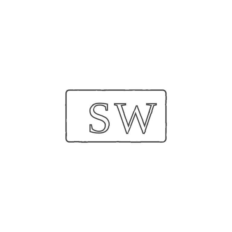
The source is a very small, low-resolution photo of a struck mark: serif roman capitals S and W, upright and reading left to right, inside a single rectangular punch with slightly rounded corners. I found no stop, pellet or device between the letters or between the letters and the frame, but the photo is too small to rule out a faint one completely. The drawing shows the same rectangular punch outline with outlined serif roman S and W, on a clean white background with a uniform grey line weight and the mark centred with a wide margin. Minor point that doesn't fail any rubric item: in the drawing the letters sit toward the right of the frame, leaving empty space on the left, and they fill less of the frame's height than in the source, where the S sits closer to the left edge and the letters nearly fill the punch height. A later round could shift the letters left and enlarge them slightly to match. Very small photograph (about 97 px wide) of a struck mark on silver: two roman serif capitals S W side by side in a roughly rectangular punch with slightly rounded corners, wider than tall (about 2: 1). No stops seen between the letters or at the border.