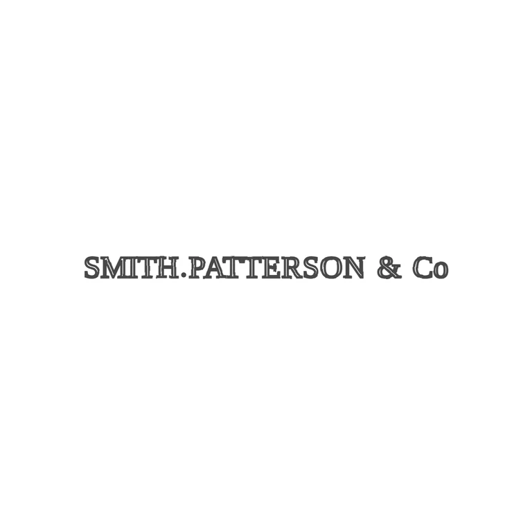
 Line
Mark variant 1
Low confidence comparison reconstruction.
Source-recorded mark text: Smith, Patterson & Co.
Source is a very small, low-resolution photo of a single straight line of incised serif roman capitals with no frame: SMITH, a solid stop sitting low between H and P (no space), PATTERSON, then a gap, an ampersand, and Co with a small lowercase o. I saw no other stops; the gaps between the N and the &, and between the & and the C, look empty. The drawing shows the same single line of serif roman capitals in the same order, with the low stop between H and P, the &, and Co with a lowercase o. There is no border in either. The drawing uses the same doubled outline stroke throughout on a clean white background, with no photo texture left. The mark is centred horizontally and vertically, with wide white margins. One caveat: at the source's resolution I couldn't tell for sure whether the o in Co sits raised or on the baseline, or whether there is a faint underline under it. The drawing puts it on the baseline, and I'm treating that as within tolerance. Single-line incuse struck mark with no border, roman serif capitals: SMITH, a small solid stop at baseline height, PATTERSON, a spaced ampersand, then capital C with a small raised lower-case o. Revision 2: the H–P separator is now a round solid baseline stop (no comma tail), and clear spaces were opened on both sides of the ampersand to match the source spacing. Everything else is unchanged from the previous drawing (font, size class, single line, no border, outline glyphs).
