 Line
Mark variant 1
Low confidence comparison reconstruction.
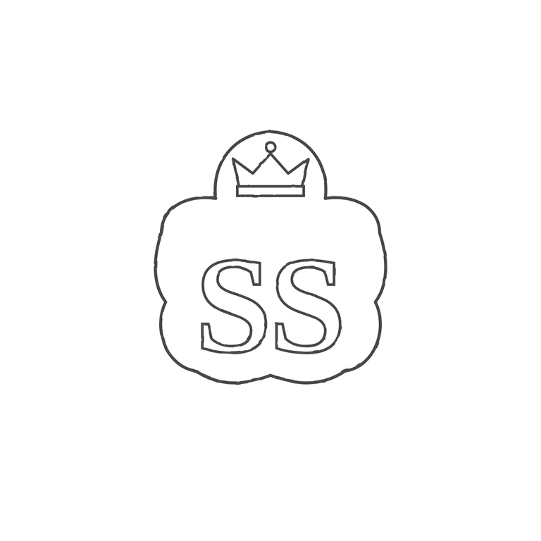
Source: a lobed/scalloped punch with a rounded projection at top holding a crown, and below it two cursive S letters with looped terminals; no stops visible. Drawing has the same glyph sequence (border, crown, S, S) and a reasonable approximation of the lobed punch shape, on a clean white background with a centred mark and generous margin. Main mismatch: the letters are drawn as roman serif capitals, not the source's script S forms. The crown is also simplified compared with the source, and a few outline segments look doubled. Struck mark in a shaped punch: a small upper lobe holding a crown outline (band, three points, top ball), widening into a lower cusped/lobed field that holds two bold serif capital S letters side by side. Single outline following the punch shape; no stops seen between or around the letters.