 Line
Mark variant 1
Low confidence comparison reconstruction.
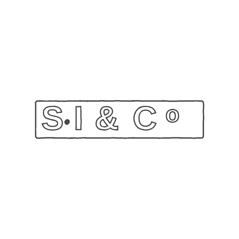
Source: one rectangular punch, roughly 4.6: 1, holding sans-serif capitals S, a solid mid-height stop, I, ampersand, C, and a raised small o (the 'Co' abbreviation). I could not make out any stop between I and &, or between & and C. The drawing has the same single rectangular frame with a similar aspect ratio (about 4.5: 1), the same glyphs in the same order, the mid-height stop between S and I, and the o raised beside C. It is a clean outline on white, centred with a generous margin. Small points that are not failures: the drawing spaces the letters more widely than the tightly packed source and leaves empty frame space after the o, where the source letters fill the punch nearly edge to edge. At this resolution there may be a faint mark under the raised o in the source, but I can't confirm it, so it is not counted. Single oblong rectangular punch with slightly rounded corners, reading S.I&Co in bold sans-serif capitals. A solid stop sits at mid-height between S and I; ampersand between I and C; a small raised lower-case o follows the C. Drawn as outlined glyphs inside one rectangular border line.