 Line
Mark variant 1
Low confidence comparison reconstruction.
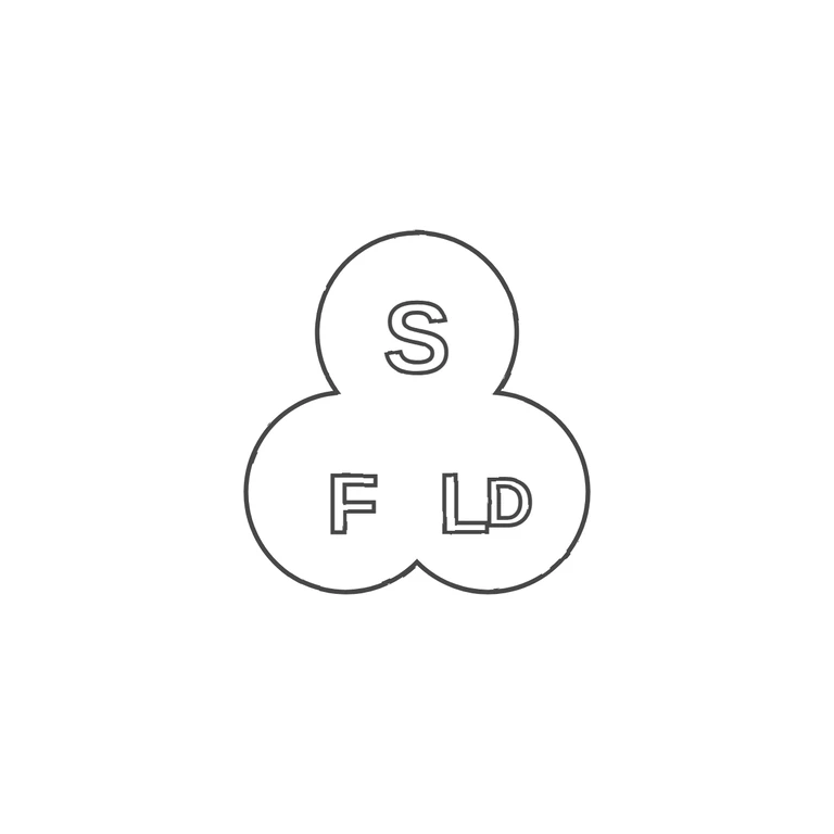
The source is a small, low-resolution photo of a trefoil (three-lobed cloverleaf) punch. It has a sans-serif S in the top lobe, F in the lower-left lobe, and L and D joined as a ligature in the lower-right lobe, with the D's bowl overlapping the foot of the L. I checked the gaps between the letters and between the letters and the edge of the punch and found no stops, pellets or devices. The drawing has the same trefoil outline in the same upright orientation, with S at the top, F at lower left and the joined L and D at lower right. The letters are drawn as outlined sans-serif shapes that match the plain block letters in the source. The background is white with no photo texture left. The line weight is the same throughout, and the mark is centred with a wide margin. Minor point: the outline of the L is a little uneven, but it does not change how the letter reads. Small struck punch with a trefoil-like outline: one lobe at top containing a capital S, two lower lobes containing a capital F (left) and L followed by a slightly smaller D (right, read as an LD/Ltd abbreviation). Plain sans-serif capitals, raised in a recessed punch. No stops seen between letters or at the border.