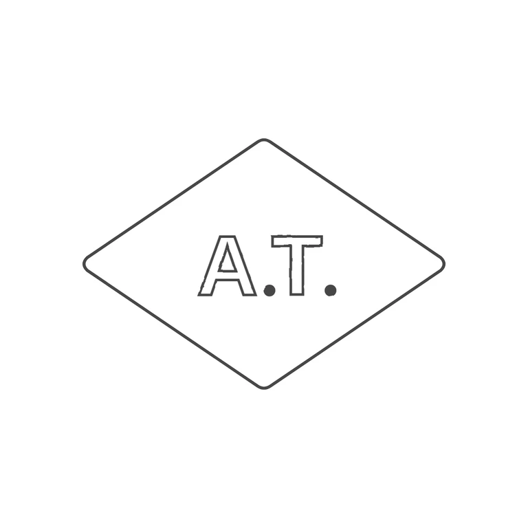
 Line
Mark variant 1
Low confidence comparison reconstruction.
Source: a wide horizontal lozenge punch (pointed left/right and top/bottom, outline appears as a double line) containing bold sans-serif capitals 'A.T.' with a solid baseline stop after each letter; no other stops or devices in the gaps. Drawing: matching wide lozenge with slightly rounded corners and a similar aspect ratio (about 1.46: 1), outlined sans-serif A and T with solid baseline stops after each, centred, upright, on a clean white background with generous margin. Glyph lists match; the double-line outline is drawn as a single frame, which counts as one border under the rules. Struck mark in a horizontal lozenge punch with slightly rounded corners. Inside are bold sans-serif capitals 'A.T.' on one baseline, each followed by a solid stop at the baseline. Revision 2: the broken dashed doubling along the upper-left and lower-right edges came from the wobble filter aliasing on the diagonal border. The filter is now removed from the border, so all four edges are one continuous line. The stop after A is moved right (cx 622 to 640) so it sits clear of the A's right foot, separated as in the source. Everything else is unchanged.