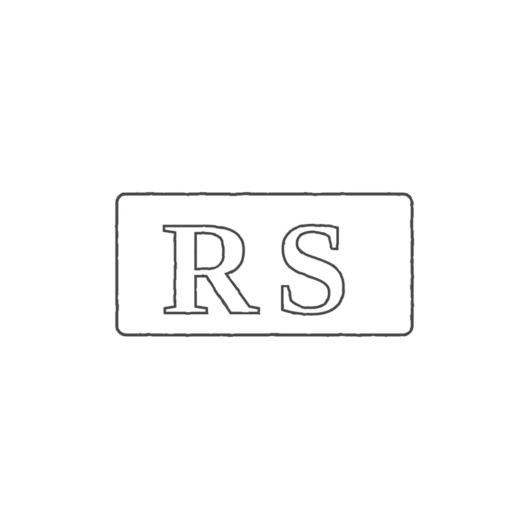
 Line
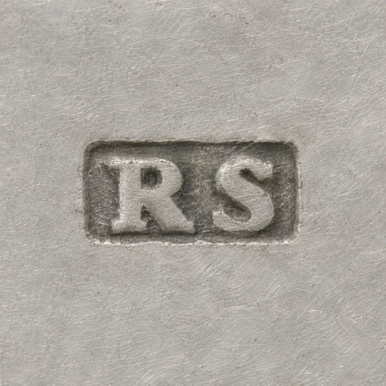 AI oxidized
Drag to compare L lineO oxidized
Mark variant 1
Low confidence comparison reconstruction.
Source: a rounded-rectangle punch holding two bold serif roman capitals, R and S, upright and reading left to right. I checked the gap between the letters and the gaps between the letters and the frame and found no stops or devices. Drawing: one rounded-rectangle frame with outlined serif roman R and S in the same order and orientation. It adds no stops or devices, uses a single even grey stroke throughout, has a clean white background, and sits centred with a wide margin. Minor difference: the drawn frame is somewhat wider than the source punch relative to the letters (the source letters fill the punch more tightly). The punch is the same kind of shape, so I did not treat this as a failure. Small struck punch: two bold roman serif capitals 'RS' set close together inside a single rectangular punch outline with slightly rounded corners, about 2: 1 width to height. The letters fill most of the punch height. No stop is visible between the letters or between the letters and the border.


