 Line
Mark variant 1
Low confidence comparison reconstruction.
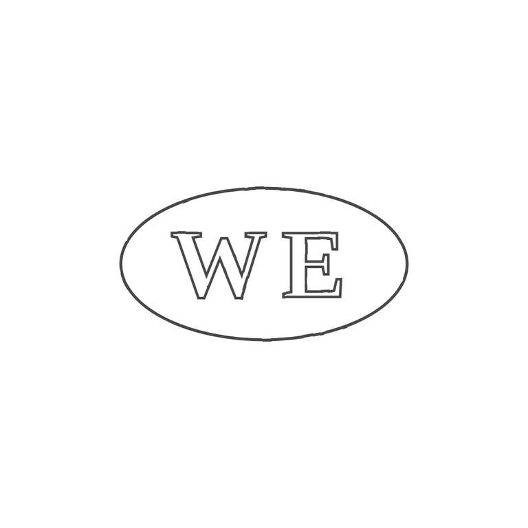
The source is a small low-resolution photo (about 130x60 px) of a horizontal oval punch holding two letters. The first is a bold serifed W. The second is a boxy, dense letter that reads as E, possibly gothic, and seems closed on its right side. I saw no stops, pellets or devices in the gaps. The drawing has a clean oval outline with an outlined roman serif W and E, no stops, on a white background, with good centring and margin. The glyphs, order, border and orientation match. Only the letterforms differ: the drawing's second letter is an open, light roman E, while the source's is square and heavy. The confidence on the exact form of the second letter is limited by the source resolution. Small struck mark: two serif capitals, read as W then E, inside one horizontal oval punch outline with slightly flattened, pointed ends. No stops seen between the letters or between the letters and the border. Drawn as one oval outline with two outlined bold serif capitals.