 Line
Mark variant 1
Low confidence comparison reconstruction.
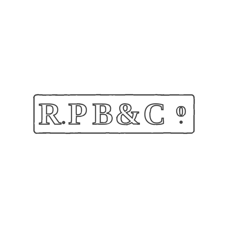
Source is a single rectangular punch with bold roman serif capitals reading R.PB&C with a raised small O over a stop (Co abbreviation); a solid stop sits at the baseline between R and P, with no stop between P and B. The drawing matches: one rectangular frame with rounded corners, serif capitals in outline, the baseline stop after R, the ampersand, C, and a raised O over a solid stop, all on a clean white background, centred with a generous margin and a consistent line weight. Minor note only: the raised O sits a little further from the C than in the source, and is drawn somewhat narrow, but the glyph and its position are correct. Single rectangular punch with slightly rounded corners, about 4.2: 1. It holds bold serif capitals 'R.PB&C' followed by a raised small 'o' with a solid stop beneath it (the 'Co' abbreviation). There is a solid baseline stop between R and P. Revision 2: the lettering now sits inside the frame with a small clearance from the left border. The letters are spread evenly across the full punch, so the raised o and its stop sit close to the right border, as in the source. The stop after R is on the baseline and kept clear of the R's leg.