 Line
Mark variant 1
Low confidence comparison reconstruction.
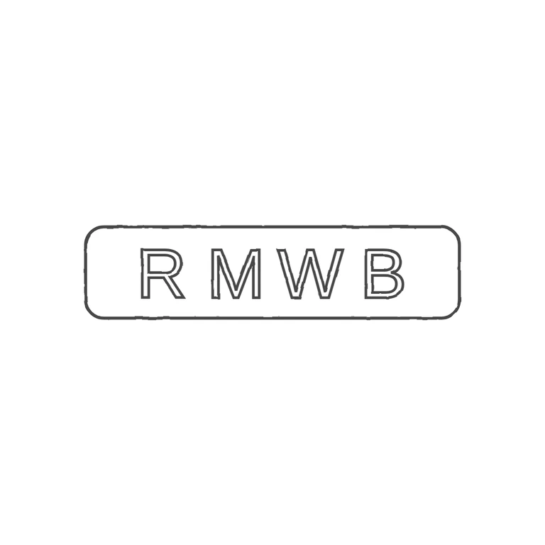
Source: a single wide rectangular punch with rounded corners holding four sans-serif capitals R M W B, evenly spaced, with no stops in the gaps between letters or between the letters and the frame. Drawing: the same rounded-rectangle frame and the four sans-serif capitals drawn in outline, in the same order and orientation, with similar proportions and spacing. Nothing has been added. The background is clean white, the line weight is even, and the mark sits centred with a generous margin. A single struck punch: an elongated rounded rectangle, about four times as wide as it is tall, holding four widely and evenly spaced sans-serif capitals R M W B in one line. The strokes are of plain, even weight. I found no stops between the letters or between the letters and the border.