 Line
Mark variant 1
Low confidence comparison reconstruction.
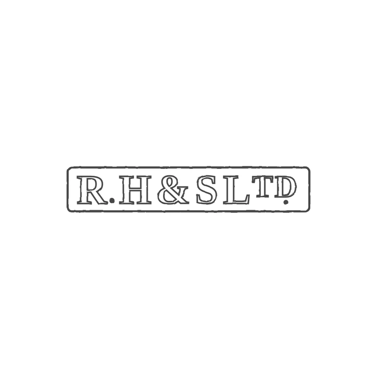
Source: a long rectangular punch with slightly rounded corners holding serif capitals R. H & S L, then a smaller raised T and D with a solid stop under the D. I found no stops between H and &, between & and S, or between S and L. Drawing: the same rectangular frame, serif outline capitals in the same order, the stop between R and H at baseline, and the smaller raised TD with a stop below. One consistent double-line outline style on a white background, centred with a generous margin. Single rectangular punch with slightly rounded corners, one outline. Bold serif capitals read 'R.H&SL' followed by a raised, smaller 'TD' (abbreviation of Ltd). A solid stop sits low between R and H. Revision 3: the superscript T and D were enlarged so their tops reach the cap line and they occupy roughly the upper two-thirds of the letter height, and a small solid stop was added directly beneath the raised D near the baseline, where the source shows a mark below the abbreviation. Everything else is unchanged from the previous round.