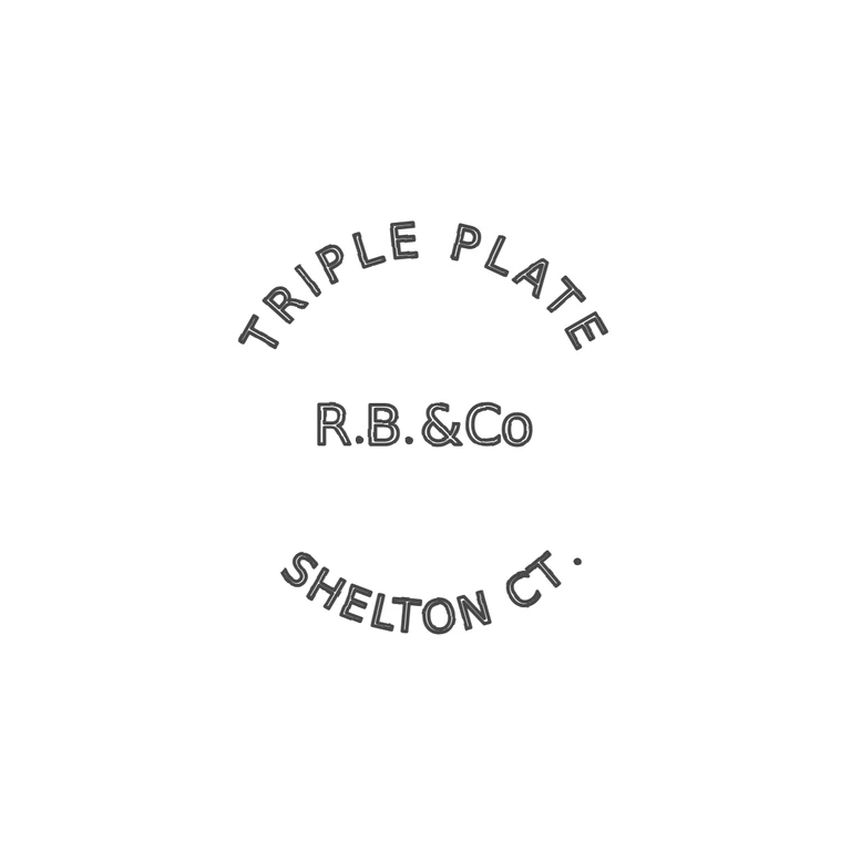
 Line
Mark variant 1
Low confidence comparison reconstruction.
Source (low-resolution, about 100 px, with a 925-1000.com watermark that is not part of the mark): 'TRIPLE PLATE' arched over the top, 'R.B.&Co' in a straight line in the centre with solid stops after R and B, and 'SHELTON CT.' arched along the bottom, reading left to right, with a stop after CT. All in sans-serif capitals with no punch outline. The drawing copies the same three-part layout: the upper arc, the centre line with both stops, ampersand and lowercase o, and the lower arc ending in a stop. The drawing's final stop sits a little higher than the baseline, which is acceptable at the source's resolution. The source is too small to rule out a faint stop between N and C, and none was transcribed. Circular-format struck mark with no visible punch outline. Sans-serif capitals 'TRIPLE PLATE' curve over the top, reading left to right. 'SHELTON CT.' runs upright along the bottom arc. The centre line reads 'R.B.&Co' in smaller capitals, with a lower-case o. Drawn as outlined DejaVu Sans glyphs on arcs, with solid dots for the stops.