 Line
Mark variant 1
Low confidence comparison reconstruction.
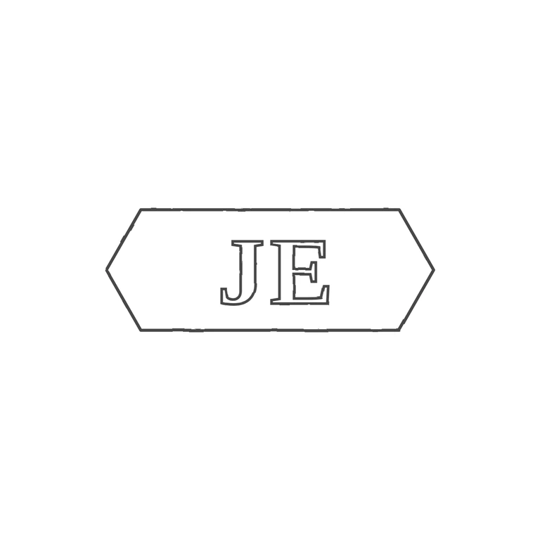
Source is a small, low-resolution photo of an incuse punch: an elongated cartouche with pointed (chevron) ends on both sides, enclosing serif capitals J E reading left to right, upright. The bright speck between the left point and the J looks like a highlight on the punch edge, not a struck pellet. I found no clear stop between J and E or between the letters and the border. The drawing shows a single-line elongated hexagon with pointed left and right ends, enclosing outlined serif J and E in the same order and orientation. The glyph lists match. Note: because of the source resolution, a very faint stop cannot be completely ruled out. Small, low-resolution photo of a single struck punch. Two roman capitals 'J' and 'E' sit side by side in the centre of an elongated punch with pointed ends (it reads as a horizontal elongated hexagon / lozenge; the right point shows clearly as a '<'-shaped edge just after the E). Letters are fairly heavy serif capitals and take up about 60% of the punch height. Drawn as one pointed-end outline with two outlined bold serif letters.