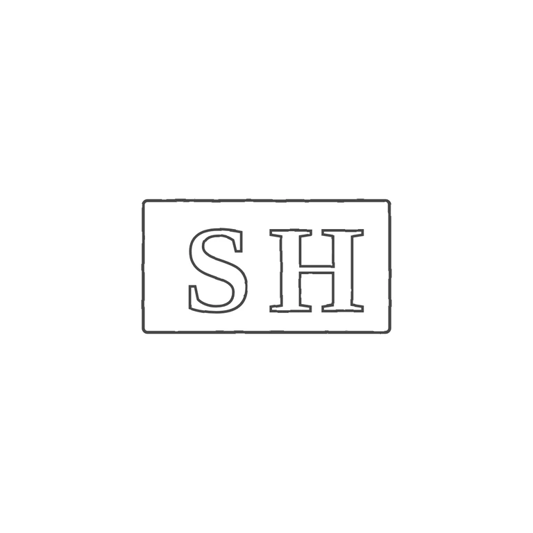
 Line
Mark variant 1
Low confidence comparison reconstruction.
Source is a small, worn photo of a rectangular punch with a single outline. Its top, bottom and left edges are visible, and the right edge runs to the photo's edge. Inside are two serif roman capitals, S and then H. The H's left upright and its mid-height crossbar are clear. Its right upright is faint and worn, near the cropped right edge, but upright plus crossbar reads as H, not as I with a stop. No pellets or devices show between the letters or between the letters and the border. The drawing shows one upright rectangle, outlined with a single line, holding serif S and H in the same order and orientation. Outline weight is even, there is no texture from the photo, the background is white, and the mark is centred with a wide margin. Minor point: in the source the letters fill more of the punch height and sit closer to the frame, while the drawing has a little more space inside the frame, especially on the left. This does not change the mark's identity. Small struck punch mark: two bold serif capitals 'S' and 'H' side by side in a plain rectangular punch with slightly rounded corners. The S is clear and heavy; the H shows a strong left stem and crossbar. No stops seen between the letters or between the letters and the border.