 Line
Mark variant 1
Low confidence comparison reconstruction.
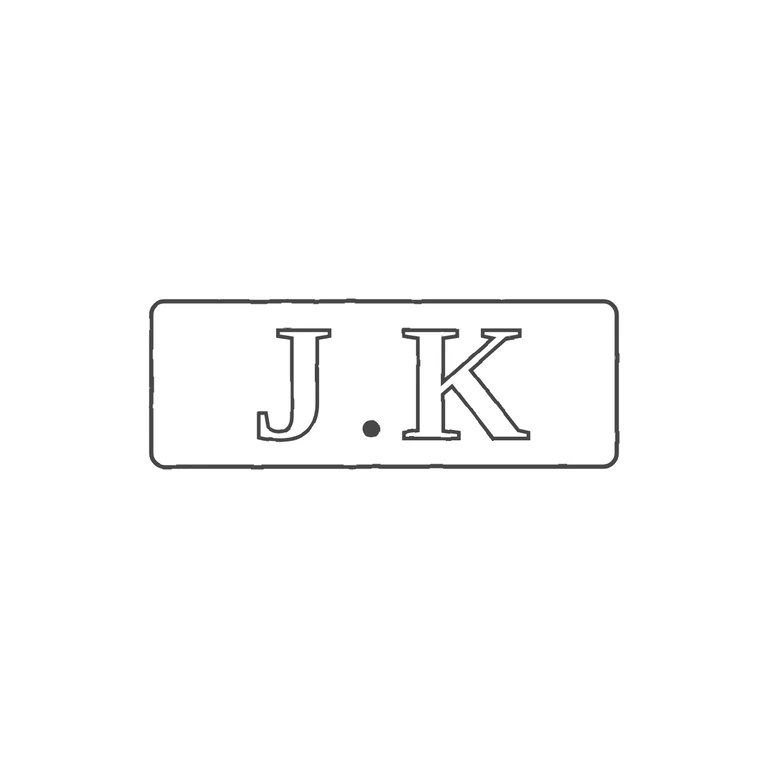
Source is a small, low-resolution photo. It shows a rectangular punch with slightly rounded corners holding the serif capitals J and K, upright and reading left to right, with a small low pellet in the narrow gap between them. The pellet is hard to make out at this size, but its position fits a baseline stop. The drawing has the same thing: a rounded-rectangle frame drawn as one line, outlined roman serif J and K, and a solid baseline stop between them. The frame shape and proportions match. The photo texture is gone, the background is white, line weight is even, and the mark is centred with a wide margin. No content was added. Small struck punch mark in an oblong rectangular punch with slightly rounded corners. It holds two bold serif capitals read as J and K, with a small solid stop between them sitting low near the baseline. The J has a full curved tail sweeping left below the line, typical of Georgian roman punches. Drawn as a single rounded-rectangle outline with outlined bold serif glyphs and one solid dot.