 Line
Mark variant 1
Low confidence comparison reconstruction.
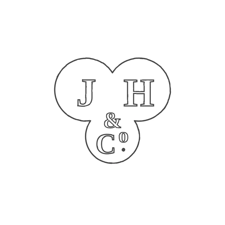
Source is a trefoil punch (two upper lobes, one lower lobe) with serif roman capitals J and H in the upper lobes, a small ampersand at the centre, and 'C' followed by a raised small letter o with a solid stop beneath it in the lower lobe. 'o' here stands for the lowercase letter of the abbreviation 'Co', not a ring device. No stop between J and H. The drawing matches: the same trefoil outline, serif outline letters J H, the &, the C, the superscript o and the stop below it, all in the same positions and order. Uniform dark-grey outline strokes on a white background, centred with a generous margin. One small point: the drawing's superscript o is a bit narrower and taller than the rounder o in the source, but it reads as the same character. Trefoil punch (two upper lobes, one lower lobe) with raised bold serif capitals J and H in the upper lobes, a small ampersand at the centre, and C with a raised small o in the lower lobe, with a solid pellet directly beneath the o (Co.). Revision 2: the ampersand and raised o are now drawn larger with stroke-width 5, so each shows as one clean outline instead of a doubled/ghosted one. The pellet now sits directly under the o, as it does in the source. Everything else is unchanged from r1.
